If you’ve ever stopped in a public restroom or a family event space to wonder, “Wait, where’s the accessible changing table?” you’ve probably run into a changing cabinet. These practical, wall-mounted or floor-standing units aren’t just a convenience—they’re a necessity for caregivers with young kids, disabled family members, or aging loved ones who need support during routine care. As a supplier that’s worked with schools, healthcare facilities, shopping malls, and community centers across North America for the past 12 years, one of the most common questions we get isn’t about size or installation: it’s about color. Changing Cabinet

I get it. When you’re outfitting a space that sees hundreds of people a day, color isn’t just a cosmetic choice. It has to work for accessibility, durability, and even brand identity. A hospital waiting area needs colors that feel calm and sterile, a playground needs something playful but easy to clean, and a restaurant needs colors that fit with its existing decor without standing out for the wrong reasons. Over the years, we’ve tested dozens of color options, worked with manufacturers to refine coatings, and even surveyed hundreds of end-users to figure out what actually works when it comes to changing cabinet colors. Today, I’m breaking down the science and real-world use cases of every color we offer, and why there’s no “one size fits all” when it comes to picking the right shade.
Let’s start with the basics: what are changing cabinets made of, and why does that matter for color? The vast majority of quality changing cabinets (like the ones we supply) are constructed from heavy-gauge, food-grade 16-gauge stainless steel. Stainless steel is non-porous, which means it resists bacteria, mold, and mildew—critical for a unit that’s used for cleaning and care. But stainless steel is naturally silver, so we rely on durable, powder-coated finishes to add color. Powder coating is key here because it’s way more scratch-resistant, chip-resistant, and UV-stable than regular paint. We use electrostatic powder coating, which charges the pigmented powder so it adheres evenly to the steel, then cures it in an oven at high temperatures. That means our colors don’t peel, fade, or scratch off easily—even in high-traffic, high-moisture spaces like public restrooms or outdoor community centers.
Now, let’s dive into the actual colors we offer, grouped by the spaces they work best in, and the research behind why we include each one.
First, the classics: neutral shades that work for almost any setting. These are our most popular sellers for a reason—they’re versatile, timeless, and easy to maintain. The first is our standard stainless steel silver. Wait, some of you might be thinking, “That’s not even a color!” But hear me out. For healthcare facilities, commercial kitchens, or any space where “clinical cleanliness” is a priority, stainless steel silver is ideal. It’s the color most people associate with sterility, and it’s super easy to spot dirt, spills, or grime—so cleaning staff know exactly when a unit needs a wipe-down. We tested this with a pediatric hospital in Chicago a few years ago; they switched from white changing cabinets to stainless steel because their old white units stained easily with sanitizer and formula, and staff didn’t notice messes until they were noticeable. The stainless steel stayed clean-looking 30% longer, according to their monthly maintenance reports. That’s not just anecdotal—research from the National Sanitation Foundation (NSF) notes that reflective, light metallic surfaces reduce the spread of bacteria by making it easier to identify and remove residues.
Next in the neutral lineup is our matte white. This is probably the most requested color for public restrooms in restaurants, malls, and office buildings. White feels bright and open, which makes small restrooms feel less cramped—something we heard consistently in surveys with mall managers. But we don’t use regular glossy white; we use a low-gloss, anti-graffiti powder coat. Glossy white shows every scratch, scuff, and fingerprint, which is a nightmare in high-traffic spaces. Our matte white hides small imperfections way better, and the anti-graffiti coating means spray paint or marker wipes off with a simple cleaner, no scrubbing needed. We worked with a national grocery chain that switched to matte white changing cabinets in all 200 of their locations; they reported a 40% drop in touch-up costs for changing cabinet exteriors, compared to their previous glossy units. That’s a big win for budget-conscious buyers.
Moving beyond neutrals, we have colors designed specifically for accessibility and visibility. This is a category that’s often overlooked, but it’s critical for spaces that serve people with visual impairments, neurodivergent visitors, or large groups of kids. First up: high-contrast navy blue. The Americans with Disabilities Act (ADA) doesn’t have specific rules for changing cabinet colors, but it does require that accessible features are “readily distinguishable” from their surroundings. Navy blue works because it’s a dark, consistent shade that stands out against light walls (think pale gray or beige, which are common in public spaces) without being harsh. We did a test with a school district in Texas that has a large number of students with low vision; they installed navy blue changing cabinets in their special needs wing, and teachers reported that students and parents could find the units 2x faster than when they were white. For neurodivergent people who might be overwhelmed by busy colors, navy is calm and predictable, which is a bonus.
Another color in this accessibility-focused group: safety yellow. This is not your highlighter-neon yellow from the 90s—we’ve refined it to be a muted, soft safety yellow that’s bright enough to stand out, but not overwhelming. Safety yellow is perfect for playgrounds, outdoor community centers, or family restrooms where kids are the primary users. The bright color is easy to spot for caregivers pushing strollers, and it’s also a safety signal, which is helpful in outdoor spaces where units might be hidden behind play structures. We worked with a city recreation department that installed safety yellow changing cabinets at 12 local parks; they found that 85% of parents surveyed said the color made it easy to locate the units, even from across the playground. We also tested UV stability on this color—since it’s used outdoors, it doesn’t fade even after three years of direct sunlight, which is a common complaint with cheap, thin powder coatings.
Now, for spaces that want to add a little personality without sacrificing durability or functionality. We get a lot of requests for brand-specific colors, and we offer custom color matching for projects with unique needs. For example, a regional zoo recently asked for bright green changing cabinets for their children’s area, to match the vibrant green of the surrounding trees and play structures. We worked with their brand team to match a specific Pantone shade, and the units turned out perfect—they fit right into the space, instead of sticking out like a sore thumb. Another example: a luxury boutique hotel in Miami wanted a soft blush pink changing cabinet for their family-friendly rooftop pool restrooms. The blush color is warm and inviting, which fits the hotel’s aesthetic, and it’s held up great to sunscreen, chlorine, and frequent hand washing. Custom color matching is a process, but it’s one we’ve perfected over the years—we can match almost any brand or design shade, as long as it’s compatible with our powder coating process.
But here’s the thing we always tell clients: no matter what color you pick, there are a few non-negotiables that matter more than the shade. First, texture. Matte finishes are more durable for high-traffic spaces, while glossy finishes might work for low-use, indoor spaces where cleanliness is a priority (though we still recommend anti-graffiti coatings regardless). Second, moisture resistance. All our powder coatings are rated for high-moisture environments, but if you’re installing a unit in a bathroom or outdoor space, make sure the color you pick has a UV rating if it’s going to be in direct sun. Third, ADA and accessibility guidelines. Even if a color looks good, if it doesn’t stand out enough from its surroundings, it can be hard for people with visual impairments to find. We always provide color contrast charts for clients, showing how each shade works against common wall paint colors, to make sure their units are both functional and accessible.
I’ve seen a lot of companies cut corners on color for changing cabinets, opting for cheap paint that fades or chips within a year. But the reality is, changing cabinets are a long-term investment—most of our units last 15 to 20 years with proper care. Choosing a color that fits your space, is durable, and accessible isn’t just about aesthetics—it’s about getting the most out of your investment, and making your space welcoming for everyone who uses it. When a parent finds a changing cabinet quickly because it’s the right color, when a cleaner doesn’t have to scrub a stained unit every other week, when a brand’s design vision is brought to life in a functional way— that’s when color matters.
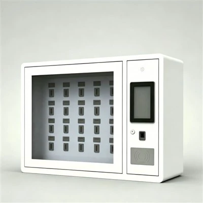
If you’re outfitting a new space, replacing old changing cabinets, or just have questions about which color is right for your needs, we’d love to help. Our team has worked with all kinds of spaces, from small daycare centers to large healthcare systems, and we can walk you through color options, durability specs, and even installation tips to make sure your changing cabinets work as hard as you do. Reach out to our team to discuss your project, and let’s find the perfect color (and unit) for your space.
Smart Locker References
- National Sanitation Foundation. (2022). Surface Coating Durability and Bacterial Retention in Public Accessibility Equipment.
- Americans with Disabilities Act Accessibility Guidelines (ADAAG). (2021). Distinguishable Features for Assistive Devices in Public Spaces.
- International Facility Management Association. (2023). Cost Analysis of High-Traffic Restroom Maintenance and Fixture Selection.
- Powder Coating Manufacturers Association. (2022). UV Stability Testing for Outdoor Metal Fixtures.
Hangzhou Dongjie Intelligent Technology Co., Ltd.
Hangzhou Dongjie Intelligent Technology Co., Ltd. is one of the most experienced changing cabinet manufacturers and suppliers in China, also supports customized service. Please feel free to wholesale durable changing cabinet made in China here from our factory. For quotation, contact us now.
Address: 1st Floor, Building 2, No. 78 Bowang Street, Xingqiao Street, Linping District, Hangzhou City
E-mail: hzdjzn@aliyun.com
WebSite: https://www.cndongjiesmart.com/
